
Now and then I come across this discussion in Color related Internet Forums:
- Are you supposed to be a better Color Expert if you follow Color Theory or is this for newbies?
And,
- Star Consultants are those who have a special sense for Color which is a kind of gift that makes them special and unique?
I was taught that you can create Color Harmonies either by instinct either by knowledge of how Color Harmonies can be created based on relationships established among Colors according to their position in the Color Wheel. I never was taught "this is better than that" and honestly feel annoyed when I realize there are people in the net discrediting the knowledge of Color Theory as if it even could be dangerous to be taken into account!
My own and personal position is you should never be rigid on these questions. Of course if you want to Consult on Color you should have an Artistic background and a practice as an artist, even if you aren't a first line one -which is rather difficult by the way, because not all of us have been born geniuses. You should know how to create your colors out from the three primaries and with the help of white, and according to my special art teacher Marina Berdalet, black should be avoided as much as possible.
I always take into account Color Relationships and Theory when painting a canvas and trying to reach that special tint, tone or shade. And I take into account Color Theory and what I was taught about creating Color Atmospheres in an Interior Design, while listening to my Color Instinct. Graphic Designers pick colors for their creations according to Color Theory and also follow their sense of Color - I think of wallpapers and textiles. You cannot assign colors to them only based in your instinct: you'll probably apply one of the known relationships and probably will adjust to coming Color Trends.
Color Theory must be well known and isn't that easy. I don't believe anything just because I've been told this or that. In fact, I've been studying hard theorists like Faber Birren, who based his knowledge in his factual experience contrasted with many scientific studies conducted during the XX th. Century. He cited many of the latter in his books and referred them in his bibliography. You can have Color Sense but if you want to devote to Color or are simply interested in the subject, you should try to learn as much theory as you can. If you follow the rules in a simplistic way, of course you can reach odd results. But the same can happen if you follow your instinct alone. So my recommendation and my believe is that you should cultivate yourself in both the artistic side and the theoretical one.
An example of well applied Color Theory follows:

Here you have two complementary colors, violet on the wall and a greenish yellow in the side-table and bouquet of flowers. Violet is filling a greater surface than yellow, which becomes the accent color here. Acting as an accent, yellow appears to have higher chroma than violet and catches the observer's eye at a glance. When you pick two complementary colors,this is how to do it: you need to give more space to one of them (violet) and less to the second (yellow). This way, a general mood is settled while you can give prominence to the accent furniture through its complementing the wall color and giving it a higher chroma at the same time. A good Color Consultant or Interior Designer will consider all of these aspects when designing a space, may inspiration come first and then Color Theory be checked to contrast inspiration or might it happen the opposite way.
About Color Systems, there is no magic in them, as Lori Sawaya explains wonderfully in an article of hers at The Land of Color. Be it the Munsell System, be it The NCS (Natural Color System), the Color Expert knows what the Notation means and that lets him or her do a right job when picking Colors.
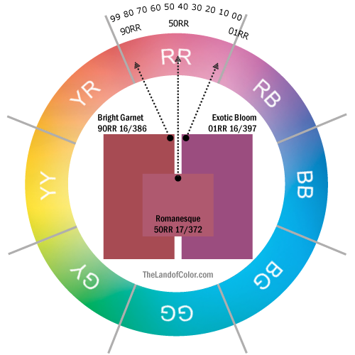
Colors like "Bright Garnet", "Romanesque" and "Exotic Bloom" have their own notation according to the Munsell System. Same happens with NCS, the official reference for Paint Colors in Spain.

In NCS they explain it with this example:

If you pick NCS S 1070-Y10R from the NCS 1950 Color fan deck, this means that this color
"is included in the standard collection (S) and lies in between the yellow (Y) and red (R) colour span with:
- 10% perceived red (the remaining 90% going towards yellow)
- 10% perceived Blackness
- 70% perceived Chromaticness
This means the colour looks like a quite strong yellow." (font)
Lori Sawaya, who has a deep knowledge of Color and Color Technology, explains it this way:
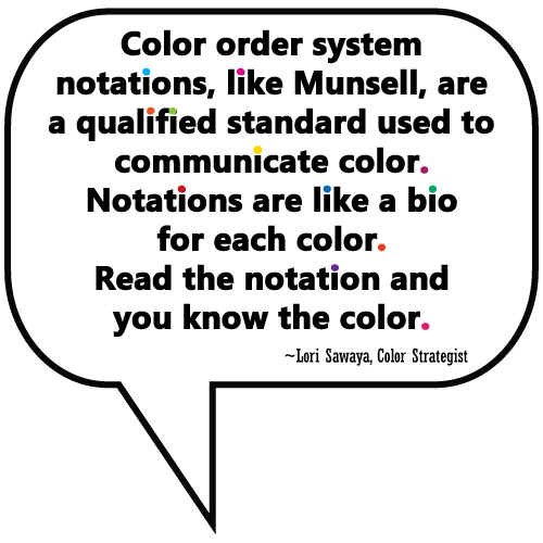

This doesn't mean that being a Color Consultant is quite easy. This means that there is a lot of Theory, Knowledge, Science and a System behind Paint Brands and fan decks, and behind any Design that needs Color as a Key Element. This is not about a magic gift that belongs to a few selected individuals only. If you understand the notation, you know about the Overtone and you know about the Undertone. As Picasso said, let Inspiration meet you while Working. You need to study hard, and you need to practice in as different ways as you can. This is my own belief and what I will always defend.
In the video that follows, Lori Sawaya, whose knowledge I admire, gives you 20 minutes of worthy explanations on how to use Color Theory and Color Wheels to help you choose colors for your works. And she doesn't avoid the difficult sides of the questions. I hope you will enjoy it.
And remember, if you need help with Color, look for an Expert that you trust. And remember, there is a lot of work behind the creation of a Color Palette.
Isabel de Yzaguirre,
La Colorista
No comments:
Post a Comment